
A Management Dashboard for Restaurant Admins.

Let’s “EATTE” Together!
Redesigning the UI/UX of a SAAS B2B Enterprise Platform.
Redesigning How Restaurants Manage their Business.
Project Overview
Role
Lead Product UI/UX Designer
Team
-
President / Stakeholder
-
Head of Dev./ PM
-
8 Developers
-
Lead Product/ UX Designer (Myself)
-
Direct Report (UI/UX Designer)
-
Content Strategy
-
User Research
-
Information Architecture
-
User Flows
-
UX& UI Design
Tools
-
Figma
-
Figjam
-
Sketch
-
Adobe Photoshop
-
usertesting.com
Skills
Intro & Background
The Problem
Opportunity
Introduction
I joined HUBB VENTURES as the lead product UX designer to redesign the "eatte.io" platform. The goal was to create an improved user experience that would increase user acquisition and retention. "eatte.io" is a complete all-in-one restaurant management software solution for both Saas and web platforms, catering to a wide range of restaurants. The redesign showed a CSAT of 99%
-
"eatte.io" is a complete management all-in-one restaurant management centralized software solution (available as both a Saas product & on the web).
-
This product powers restaurants, from local cafés and iconic fine dining restaurants to global quick-service chains.
What ?
Why?
The “eatte.io” app. was not meeting sales expectations, this was a challenge for the HUBB admins, as this would hamper the company’s growth.
Constraints
-
Timeline.
-
The platform lacked prior UX Research.
-
Gradual implementation.
The existing "eatte.io" app was not meeting sales expectations, posing a challenge for the HUBB admins and hindering the company's growth. The platform lacked prior UX research and had gradual implementation.
There was an opportunity to tap into the market of over 1 million restaurants in the US, employing 15.6 million workers and contributing over 4% to the US GDP.

1 M+
Restaurants located in the US,
with 15.6M workers. Sales were heavily affected by the pandemic.

11 M+
Jobs and over 4% of the US GDP
attributable to the restaurant industry. (Forbes 2020)
The Process
To ensure the solutions met user needs, I followed a comprehensive design process, including background research, stakeholder and user interviews, usability testing, and competitive analysis. This led to the identification of key issues and user preferences.
Bring to Life
Ideate
Specify
Empathize

Verify
-
Background Research
-
Stalk-holder/user interviews
-
Usability testing & Competitive Analysis
-
Persona
-
Feature Prioritization
-
Mood-board
-
User flow
-
Sketching
-
Low-Fidelity Wireframes
-
High Fidelity Wireframes
-
Design System
-
Prototyping
-
Continuous Testing
Through out
the Design
Process & After.
Empathize
Before HUBB VENTURES even hired a product design team, a beta release of the new platform had been implemented. These mockups were created without any basic research or usability testing. In the previous design, everything blends in with the background. The previous design also had a lot of inconsistencies we had to solve for, inconsistent spacing throughout the design, and the page lacked various popular design features & options. Analysis of the dashboard showed multiple issues that did not focus on the targeted audience's needs.
Key Findings
User Research Summary
-
I performed user research activities to gain insights into the restaurant industry, daily tasks, and the psychology of the target audience.
-
I conducted virtual interviews to gather a comprehensive understanding of the users' needs and preferences.
-
To improve the user experience of our current platform and dashboard, I conducted moderated usability testing to identify pain points and areas for improvement.
-
Additionally, I conducted a competitor and SWOT analysis to gain a deeper understanding of our product's positioning in relation to competitors.
Key Findings
-
Users desired more options and customization abilities within the dashboard.
-
Analytics of sales, revenue, inventory, and employee scheduling were crucial data points for users.
-
The user flows and information architecture were confusing, and the UI lacked a modern design and structure.
-
The app was not user-friendly and caused emotional overload and confusion


After performing usability testing with many targeted users, the results showed that the existing dashboard was confusing and not user-friendly.
User Issues within the current App.
I analyzed user feedback from interviews and usability tests on the current app. Based on this data, users have expressed difficulties in the areas shown in the graph below.

Usability Testing
User Journey
Content Audit.
90%
85%
60%
20%
Key takeaways from the testing.
85% of users had either navigation issues or user-flow confusion.
Many users would like to find clearer shorter navigation in the process with a straight -forward user flow that would use -up minimal time from users.
Project Goals
SPECIFY
"How can we improve the dashboard's users' experience & interface?"
the project goals I set out to achieve were both simple and ambitious. The main focus was on creating a dashboard that catered to the needs of decision makers, typically restaurant owners or managers. The specific goals for this project were as follows:
Goal # 1 :
Redesign data visuals in a way that is easy for restaurant administrators to understand.
Goal # 2 :
Enable seamless control and management of tasks within the platform.
Goal # 3 :
Develop a modern and visually appealing UI for the dashboard, while ensuring maximum utilization of available features.
Goal # 4 :
Enhance the dashboard's functionality by incorporating additional features and providing the ability for customization and personalization, in order to increase its overall utilization

User Insights

Rob is a restaurant owner of multiple branches in NYC.
“All in one place.”
-
"I have a software management app, but it’s limited. I am always busy & want to check my inventory, employees, sales & revenue on my monitor or phone anytime."
-
"I do not have time to use an app if it is not straightforward; I won't change my current software unless I can feel it really adds value to my business. My time is money."

Lisa is a restaurant manager located in a shopping center in NJ.
"I need to keep my staff updated.”
-
"I need to manage POS, my inventory, kitchen & employees especially when we are in the weeds."
-
"As the manager of a branch, I must keep the owner updated & make sure my staff is prompt."
-
"Also above all, I need to check my sales & revenue reports to understand the pattern of my sales to understand what is working & what is not."

GALE IS THE MARKETING MANAGER OF A FAMOUS CHAIN.
“I need to have access to the new trends and check on sales, to see what is popular.”
"I am the marketing manager having marketing assets all in one place is useful & will save me time. I must keep the owner updated & make sure my staff is prompt."

DAVE IS A CHEF IN A FINE DINING RESTAURANT IN CA.
“ I need to be organized.”
-
"I am a chef, I have worked in several restaurants. My use of the software is focused on KDS & printed tickets."
-
" I must keep it organized especially when we are in the weeds."
Through user research, I gained insights into the needs and pain points of different user personas:
INSIGHT #1
INSIGHT #2
INSIGHT #2
Top Priorities- MVP
Business Goals-MVP
Phase 2
Prioritizing the most important design decision that would reflect the crucial needs of both users & business requirements.
Prioritizing design decisions that align with “business goals” & simultaneously fulfilling restaurant staff needs.
Adding extra design decisions to the backlog as a “Phase 2 -Priority that would reflect the crucial needs of both users & business requirements.

Design Solutions & Iterations

IDEATE
From Findings to Features
Based on insights from research like business vision, users' needs & wants were collected & analyzed through testings, interviews & surveys.
The below anatomy of the dashboard was constructed to reflect the needed features.

Vision
An app/platform that "empowers" restaurants through accessible impactful data, to manage and control all daily tasks.
Envisioning a Solution
The anatomy of the solution


BRING TO LIFE
Considering UI Design Solutions
I explored various design iterations for the new dashboard concept, aiming to simplify access to inventory, analytics, and marketing options. The final design featured compact and customizable widgets, drop-down menus for data control, and a collapsible sidebar for extra shortcuts.
Some Concepts include:
-
Simplify the continuous access to inventory, purchases, payrolls, sales reports & marketing options, etc.
-
Get continuous alerts, notifications, and marketing proposals to increase sales and monitor business day-to-day issues
-
Have an online & offline option
-
Have all data and info easily accessible anywhere and on any device
-
Have continuous upgrades, customer service, and integrations to the main product and a variety of the number of services provided
-
Customize their Dashboard according to daily usage & personal preference to make access to info faster, and seamless, and use the least possible mental stress
-
Have the service with a good price/rate


First Iteration
Considering UI Design Solutions
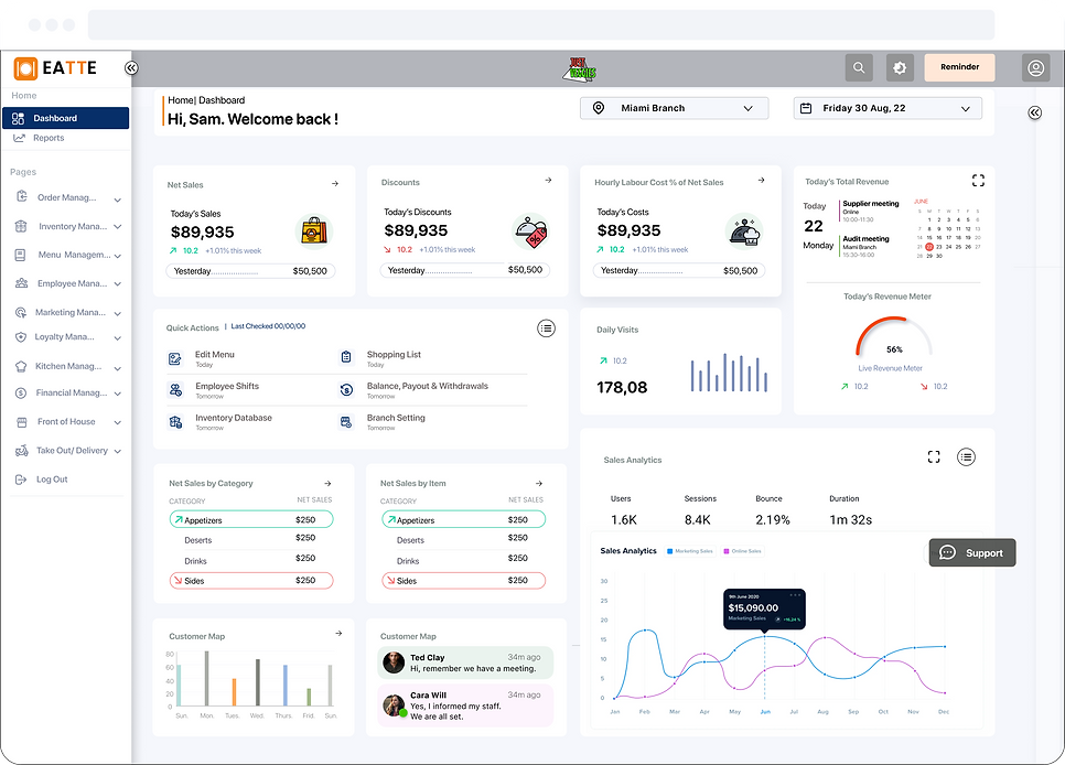
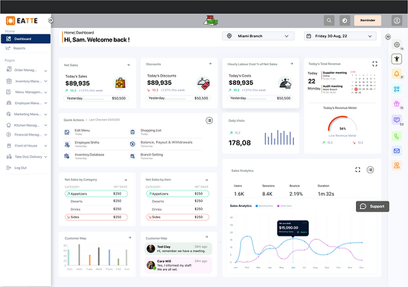
Final Dashboard Iteration.
Below you will find the finished design. During one of our weekly meetings, we decided to make the widgets a little bit smaller so we can fit more on the screen. We also decided to take out the dividers within the widgets to save even more pixels.
Collapsable sidebar shortcuts
Second Desktop Iteration
Mobile Iteration
Validation & Testing

VERIFY
USER TESTING
Does it Really Work?
I conducted more than ten moderated usability testing sessions on the first dashboard and on the redesigned prototype, to ensure that the information architecture made sense & had simpler & direct terminology.
Moderated usability testing sessions with targeted users showed a CSAT of 99% for the redesigned prototype. Changes were made based on user feedback, including redefining labels, simplifying data control, and rethinking widget design
Redefining Labels
CHANGE #1
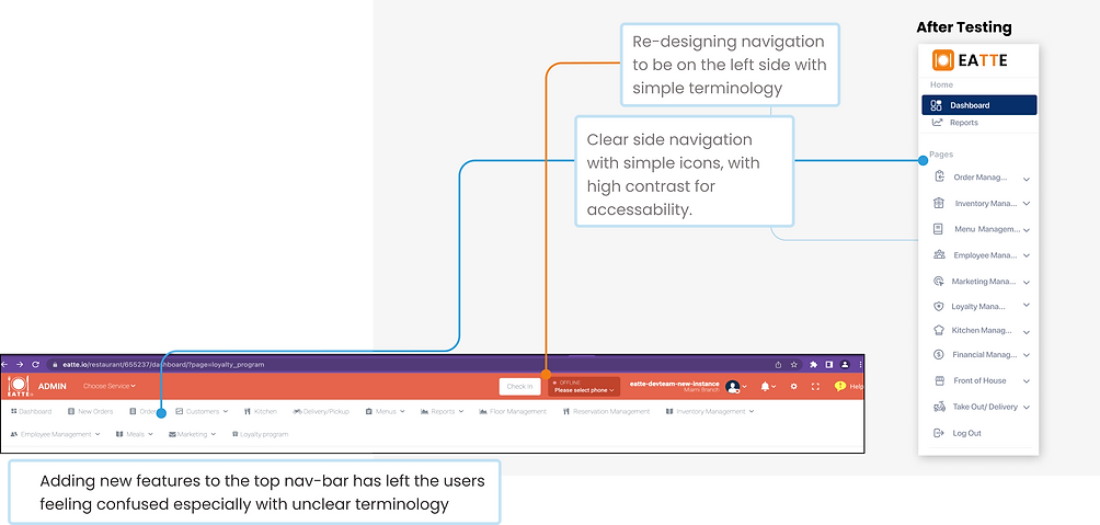
As 99% of testers would search through other tabs & found terminology confusing, that is why redefining labels was crucial. In addition, users found the top navigation bar unpractical & unfamiliar.
CHANGE #2
Controlling Data instantly
Creating 2 drop-down menus that control all data & analytics that appear on all cards, saves both "Time" & "Effort".
Drop-down menus control displayed data & analytics of both displayed for branch Location & period of time or specific dates, with just a push of a button.

Previous Design Before Testing

The usability testing on the prototype showed a
CSAT of 99%
CHANGE #3
Re-thinking & Designing compact Widgets:
Widgets were the building blocks (atomic design concept) of the dashboard, diversifying widgets according to needs. The widget UI style was inspired by the iOS widget style, to provide a modern and familiar appeal.
Widgets were selected based on the survey, grading what users found mainly used on dashboards.
DISCOUNT CARD / WIDGETS


Simple iOS inspired designs with illustrations. The top drop 2 menus allow control of all info on widgets (location & period of data)
Redesigning widgets to improve visual appeal & following modern style trends. Focusing on high contrast and accessibility. Selected illustrations were chosen with black outlines to increase contrast.
BEFORE THE REDESIGN
NEW STYLED WIDGETS
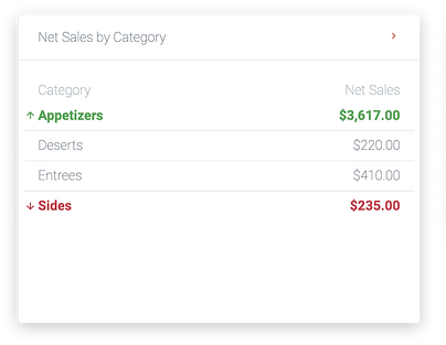
CARDS / WIDGETS WITH TABLES
Redesigning widgets with tables & trying to improve visual appeal & following modern style trends. Focusing on high contrast and accessibility. Selected illustrations were chosen with black outlines to increase contrast.


The newly styled widgets are simple compact & iOS inspired, these can be expanded.
The previous widgets were dull with wasted space. The arrows are too small.
New Widgets have 16px Gutters, while SF Pro fonts are black; with white backgrounds to increase contrast & accessibility.
ADDING A VARIETY OF FEATURES THROUGH CARDS/WIDGETS.
Creating multiple widgets depending on kind of data, analytics or feature to increase utilization of the dashboard based on user validation.
BEFORE THE REDESIGN
Rigid large widgets with a dull unappealing UI Style.
Noting that selected widgets were chosen in the newly designed dashboard based on interviews & surveys of the most used tasks/ data on the dashboard.
NEW STYLED WIDGETS
iOS Inspired Widgets with a modern & bright UI Style. A selection of different widgets that display required data.


CHANGE #4
Adding a right collapsable sidebar for extra shortcuts.
Widgets were the building blocks of the dashboard, diversifying widgets according to needs. The widget UI style was inspired by the iOS widget style, to provide a modern and familiar appeal.
Widgets were selected based on the survey, grading what users found mainly used on dashboards.
COLLAPSABLE
CHEVRON

NOTIFICATIONS
Settings
Accessibility
INTERNAL
MESSAGING
PHONE DIRECTORY
EMAIL.
DIRECTORY
TEAM CHATS
Notifications
Custimize Dashboard
Gift Cards

Design System
Considering UI Design Solutions
Creating a Design System
Creating a simple design system inspired by iOS :
using SF Pro Fonts, Icons were based on Heroicons, while additional icons were added for uncommon icons from “Polaris”, “and iOS (Human Interface Design)” and some I created from scratch to blend with the icon group style.
We previously had an outdated color palette in place that wasn't complying with ADA standards.


Comparing Dashboards
Before & After
Conclusion & Next Steps
Final Thoughts
Next Steps.
The redesigned "eatte.io" dashboard demonstrated significant improvements in user experience and satisfaction. Further steps recommended include conducting additional usability testing, measuring task completion rates, implementing new features, and exploring dashboard customization options specifically:
-
Conduct another round of usability testing
-
Measure task completion rate %
-
Implement new features into the Collateral widget
-
Ideate on the statistics card and possibly introduce new data points for our users.
-
Continue working on "Phase 2"- Dashboard Customization features like drag & drop & more flexibility for the user.

Thank you so much for reading my case study.
"eatte.io" made me realize just how difficult it can be to produce an application that you know very little about. I had very little knowledge about the restaurant industry coming into the project, so that became problematic when designing around a few screens.
Luckily, I managed to put some time aside to fully understand the product, our competitors, and our business requirements. This made me realize just how important it is to have somebody who knows A LOT about the subject of the tool you are developing in order to create a well-rounded experience for the user.
REACH OUT TO ME!
Searching for a product, UI/UX designer, or UX researcher that shows passion in their work? Interested in working together? I'd love to hear from you!
eatte.io - Enterprise B2B Platform
Re-designing the user experience of "adding to inventory"
I have Improved the efficiency & experience of inventory user-flows & IA of the "eatte.io" platform, Usability testing showed increased CSAT by 99%, to be launched soon.
