
Improving the UI/UX of a SaaS B2B Enterprise Platform for Restaurant Admins' Inventory Management

Let’s “EATTE” Together!
ROLE
TEAM

SKILLS


TOOLS
-
Figma
-
Figjam
-
Sketch
-
Adobe Photoshop
-
usertesting.com
Lead Product UI/UX Designer
-
President / Stakeholder
-
Head of Dev./ PM
-
8 Developers
-
Lead Product/ UX Designer (Myself)
-
Direct Report (UI/UX Designer)
-
Content Strategy
-
User Research
-
Information Architecture
-
User Flows
-
UX& UI Design


INTRO & BACKGROUND
I joined HUBB VENTURES as the sole Product UX Designer tasked to redesign the "eatte.io" platform.
I later added a direct report to my team in order to reach the target of creating an improved user experience that in turn would increase user acquisition & retention. The redesign showed a CSAT of 99%
-
"eatte.io" is a complete management all-in-one restaurant management centralized software solution (available as both a Saas product & on the web).
-
This product powers restaurants, from local cafés and iconic fine dining restaurants to global quick-service chains.
What ?
Project Vision
Why?
The “eatte.io” app. was not meeting sales expectations, this was a challenge for the HUBB admins, as this would hamper the company’s growth.
Constraints
-
Timeline.
-
The platform lacked prior UX Research.
-
Gradual implementation.
-
Empower Restaurants through accessible powerful data, to manage and control all daily tasks.
-
Creating an intelligent inventory management platform which is crucial to the success of any restaurant.
THE PROCESS

In order to create an application deemed to be useful and usable for the end users, I used the following design process to make sure my solutions met the needs of users by continuously evaluating and adjusting the designs
-
Continuous Testing
Through out
the Design
Process & After.
-
Background Research
-
Stalk-holder/user interviews
-
Usability testing & Competitive Analysis
-
Persona
-
Feature Prioritization
-
Mood-board
-
User flow
-
Sketching
-
Low-Fidelity Wireframes
-
High Fidelity Wireframes
-
Design System
-
Prototyping
BRING TO LIFE
IDEATE
SPECIFY
EMPATHIZE

VERIFY

EMPATHIZE
Investigating the Previous Inventory Management Platform
Before HUBB VENTURES even hired a product design team, a beta release of the new platform had been implemented. These mockups were created without any basic research or UX/ usability testing. In the previous design, everything blends in with the background. The previous design also had a lot of inconsistencies we had to solve for, inconsistent spacing throughout the design, and the page lacked various popular design features & options. Analysis of the user journey showed multiple issues that did not focus on the targeted audience's needs.
Services provided by this platform.
Analyzing services, navigation & terminology of the previous navigation before re-design.
This is shown in detail in the first project on the case study screen.
BEFORE REDESIGN
Horizontal navigation bar that was in the previous platform

AFTER REDESIGN
Vertical navigation bar in the redesign.

"eatte.io" is an everyday management software solution that offers:
Order Management
Inventory Management
Employee Management
Marketing Management
Front of House Management
Kitchen Management
Financial Management
Menu Management
Loyalty Management
Take Out / Delivery Management
The focus of this case study
Analyzing the User Journey of "Adding a Product to Inventory".
THE PROBLEM
The current user journey is characterized by confusion, errors, and time-consuming steps that hinder the user's progress.
Users experienced complete confusion and were unable to accomplish their task

1ST STEP
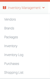
The user initiated the task from the dashboard and proceeded to click the "Inventory Management" option located in the horizontal top navigation bar.

01-Dashboard Screen
After attempting to select an option from the drop-down menu to add inventory, the user experienced confusion and was unable to complete the task.
This was a five "guessing game" until the user found the right path as explained below.

2ND STEP
THE CONFUSION
-
I observed that conflicting terminology used in the interface led to users being unable to complete their tasks.
-
It was identified that there was a need to revise the information architecture for the project.
The top navigation box had overlapping and confusing userflow options that needed to be addressed.
Exploring Navigation on Dashboard Screen.
2
1

MOST CLICKED THIS IN THEIR 1ST ATTEMPT
THIS WAS FINALLY SELECTED AFTER GUESSING AND FEELING FED UP.
MOST CLICKED THIS IN THEIR 2ND ATTEMPT
During this stage, it was discovered that 90% of users encountered challenges due to confusion when selecting the appropriate path to accomplish their task. Despite selecting what seemed to be logical paths, users failed to reach the desired page after several attempts. Specifically, the following paths were attempted before finding the correct one:
-
Inventory Management > Inventory (Incorrect path)
-
Inventory Management > Inventory Log (Incorrect path)
-
Inventory Management > Vendors (Incorrect path)
-
Inventory Management > Brands (Incorrect path)
-
Inventory Management > Packages (Correct path was eventually found)
3
3RD STEP
Package Management Screen

As the user attempted to complete the task, they selected 4 other choices that they believed to be logical user flows before finally clicking on "Package Management". However, they still experienced confusion when attempting to complete the task even after reaching the Package Management screen.
I have identified several user pain points through research, virtual interviews, and moderated usability testing.
-
Frustration was noted due to conflicting terminology and information architecture, & it led some users to consider abandoning the usability test.
-
Tasks were time-consuming due to confusion in selecting the correct path to accomplish their goal.
-
The user was journey error-prone resulting from overlapping navigation boxes and unclear options.
-
The unfriendly user interface design caused difficulty in understanding how to continue with the task.
-
Below is a user journey map illustrating how users interacted with the task of adding inventory.
PAIN POINTS
USER JOURNEY

User research summary
-
I Conducted virtual Interviews to gain insights into the restaurant business, daily tasks & the targeted audience's psychology.
-
I moderated usability testing to identify pain points and improve the user experience of the platform and add products to the inventory.
-
Conducted a competitor & SWOT analysis to better understand how our products compare to competitors.
Key Learning from Research
-
Users prefer a simple and seamless user flow from the dashboard to adding a product to inventory with minimal clicks.
-
Users want the ability to input more data about the product to make it easier to review later in the database.
-
Users consider intelligent inventory management crucial to staying on top of their stock.
-
Confusing user flow and IA terminology were noted as issues.
-
The UI was outdated and lacked structure familiarity.
-
Lack of guidance and direction caused emotional user overload and confusion.
-
Inventory database needs more filters, images, and improved UI styling for a better human-centered experience.
-
Users wanted the ability to automatically fill in a form and compare data to that in the shopping list or inventory list while filling a form through an unfolding side window.



THE RESULTS
User Issues within the current App.
Based on user interviews & usability tests done on the current app., Users report having difficulties in the following areas (survey & user interviews)


Notes
Showed extreme frustration.
All except one failed task.
Results & error rating
4 = A usability catastrophe; fixing it before the product can be released is imperative.
0 = Represents that it does not have a usability problem at all.
Key insights reflected from user research
Learning about our targeted users
Based on Interviews, analyzing business requirements, affinity, empathy maps, 2 1/2 D personas & regular personas. Ultimately, I decided to focus more on the "decision makers"; those who make the final decision to buy our product as it is a B2B Saas product. Simultaneously as for other users, those who represent restaurant personnel, the same analysis has been done for the interviewed users as listed above in the previous list.

ROB IS A RESTAURANT OWNER OF MULTIPLE BRANCHES IN NY.
“All in one place.”
-
Efficiency & clarity are major factors
-
"I do not have time to use an app if it is not straightforward; I won't change my current software unless I can feel it really adds value to my business. My time is money."

LISA IS A RESTAURANT MANAGER OF A RESTAURANT LOCATED IN A SHOPPING CENTER IN NJ.
"I need to keep my staff updated.”
-
"I need to manage my inventory especially when we are "in the weeds."
-
"As the manager of a branch, I must keep the owner updated & make sure my inventory stock is up to date & prompt."

DAVE IS A CHEF IN A FINE DINING RESTAURANT IN CA.
“ I need to be organized.”
-
"I am a chef, I have worked in several restaurants. My use of the software is focused on knowing our inventory is always up-to-date."
-
" I must keep it organized especially when we are in the weeds."

SPECIFY
"How can we improve the user's experience to add a product to inventory?"
Project goals
Seemingly, simple but ambitious.
With the dashboard I'd create, the goals revolved around the "decision makers" who would have access to all features of this platform. Most likely an owner or a manager of a restaurant.
Goal # 1 :
Redesign easy-to-understand data visuals for restaurant admins to add products to their inventory with minimal effort.
Goal # 2 :
Create a more modern user-friendly styled UI that enables easy access to inventory management tools with maximum utilization of features.
Goal # 3 :
Deliver a seamless user experience that improves productivity and saves time for our users.


IDEATE
SYNCING APP & DASHBOARD FUNCTIONALITY
From Findings to Features
Based on insights from research like business vision, users' needs & wants were collected & analyzed through testings, interviews & surveys.
The below anatomy of the dashboard was constructed to reflect the needed features.
VISION
-
Adding a product to inventory through a simple smooth user flow.
-
This is done by automatically opening a form to fill in data to add a product to the inventory.

MID-FIDELITY WIREFRAME

HIGH-FIDELITY WIREFRAME
ENVISIONING A SOLUTION
The anatomy of the solution
The user flow smoothly opens into a fillable form that gives the option to compare what the product being added to the info in "Purchases", "Shopping List" & "Inventory Database".
Left-side navigation bar opens sub-menu for "Inventory Management", with simple straight forward terminology.
Buttons when clicked unfold a vertical left drawer to allow the user to compare info without navigating to another screen.
A vertical collapsable left-side drawer that allows the user to compare info without navigating to another screen.
It also allows some editing of the info in the drawer.
The form consists of widgets that adjust accordingly to viewports dimensions.
a button that navigates directly to the full screen if needed.


BRING TO LIFE
Considering UI Design Solutions
Exploring final concepts for inventory management screens.
-
Simplify the user flow to add inventory & access to the inventory database with minimum effort & clicks.
-
Adding buttons that open a left-side drawer to compare the database & shopping list while inputting products' data.
-
Have an online & offline option.
-
Redesigning the inventory database screen linked to inventory & adding more filters.
MOBILE ITERATION
FIRST ITERATION
Considering UI Design Solutions
Final Dashboard Prototype.
Below you will find the finished design. During one of our weekly meetings, we decided to make the widgets a little bit smaller so we can fit more on the screen. We also decided to take out the dividers within the widgets to save even more pixels
Collapsable sidebar shortcuts

AFTER

These links are incorporated and linked to the main screen while adding or editing inventory
Simple Seamless User-flow
DASHBOARD SCREEN
Platform home screen/Dashboard Screen
Menu has been moved from a horizontal top navigation to a side nav-bar.
SIDEBAR NAV. MENU WITH INVENTORY SUB-CATEGORIES.
The side navigation bar expands to open sub-menu categories.
with simple terminology
Select "Add to Inventory"
ADD PRODUCT TO INVENTORY SCREEN
Add Inventory opens a fillable form that directly allows user to fill, revise shopping list and add multiple products then save


IA & Simple Terminology

Considering UI Design Solutions
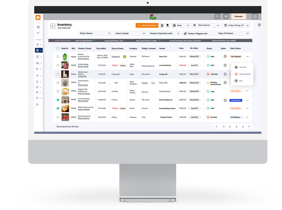
Exploring various iterations for the inventory database screens.

Previous Database Screen
First Iteration

Concepts sent to dev. before the introduction of the final iteration.


Final Iteration

VERIFY
USER TESTING
Does it Really Work?
I conducted more than ten moderated usability testing sessions on the first dashboard and on the redesigned prototype, to ensure that the information architecture made sense & had simpler & direct terminology.
CHANGE #1
Redefining Labels & Navbar

As 99% of testers would search through other tabs & found terminology confusing, that is why redefining labels was crucial. In addition, users found the top navigation bar unpractical & unfamiliar.
Previous Design Before Testing

The usability testing on the prototype showed a
CSAT of 99%
CHANGE #2
Input Data instantly in Adjustable Widgets.
by clicking "Inventory Management" > then "Add a Product"
This automatically opens a fillable form made-up of adjustable widgets. each widget has input fields. Widgets were the building blocks (atomic design concept)


Previous Design Before Testing
Redesigned Screen
Sample of Widget
New Widgets have 16px Gutters, while SF Pro fonts are black; with white backgrounds to increase contrast & accessibility.
BEFORE THE REDESIGN
Dull unappealing UI style with wasted space.
NEW STYLED WIDGETS
iOS Inspired Widgets with a modern & bright UI Style. A selection of different widgets that display required data.
CARDS / WIDGETS WITH INPUT FIELDS & DROPDOWN MENUS
Redesigning widgets with input fields & dropdown menus & trying to improve visual appeal & following modern style trends. Focusing on high contrast and accessibility. Selected illustrations were chosen with black outlines to increase contrast.

Style Guide for Drop Down Menus in Input Fields
CHANGE #3
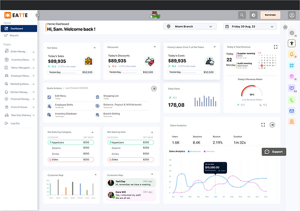
Adding a right collapsable sidebar for extra shortcuts.
Widgets were the building blocks of the dashboard, diversifying widgets according to needs. The widget UI style was inspired by the iOS widget style, to provide a modern and familiar appeal.
Widgets were selected based on the survey, grading what users found mainly used on dashboards.
COLLAPSABLE
CHEVRON

SETTINGS
ACCESSABILITY
NOTIFICATIONS
CUSTOMIZE
DASHBOARD
GIFTCARDS
INTERNAL
MESSAGING
PHONE DIRECTORY
EMAIL.
DIRECTORY
TEAM CHATS
Considering UI Design Solutions
Creating a Design System
Creating a simple design system inspired by iOS :
using SF Pro Fonts, Icons were based on Heroicons, while additional icons were added for uncommon icons from “Polaris”, “and iOS (Human Interface Design)” and some I created from scratch to blend with the icon group style.
We previously had an outdated color palette in place that wasn't complying with ADA standards.


Final Thoughts
Next Steps.
To ensure that "eatte.io" team continued to validate the design post-engagement, our team put together some recommended next steps regarding ways their team can continue to iterate, specifically:
-
Conduct another round of usability testing
-
Measure task completion rate %
-
Implement new features into the Collateral widget
-
Ideate on the statistics card and possibly introduce new data points for our users.

Thank you so much for reading my case study.
"eatte.io" made me realize just how difficult it can be to produce an application that you know very little about. I had very little knowledge about the restaurant industry coming into the project, so that became problematic when designing around a few screens.
Luckily, I managed to put some time aside to fully understand the product, our competitors, and our business requirements. This made me realize just how important it is to have somebody who knows A LOT about the subject of the tool you are developing in order to create a well-rounded experience for the user.
REACH OUT TO ME!
Searching for a product, UI/UX designer, or UX researcher that shows passion in their work? Interested in working together? I'd love to hear from you!

Save App.
Interactive design for a saving app.
A freelance product that shows simple interactions.